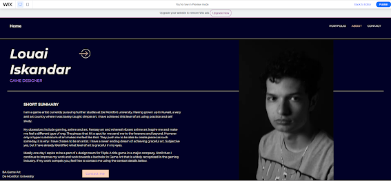
Today I will be updating my website with a photo on the about page. I used a monotone picture with a low profile approach because I believe it fits my website color palette as the website isn't overly vibrant.

I then further adjusted the positioning of the text i wrote to be more fitting and organized. I moved the summary paragraph slightly up as I found it to be far down and with an awkward space in between.
I then proceeded to add the social links, I used bright icons to represent the hyperlinks as shown below:

I also had a look at the mobile view of my about page, I found it flowed really well and everything fit nicely without me having ot change anything so I just left it as it is.

Good taht you have posted this - just post other updates and changes
ReplyDelete